Why Motion Graphics Make a Small Business Look Bigger Than It Is
Lower thirds, animated logos, and on-screen text do more than decorate a video, they build the visual consistency that makes customers remember your business.
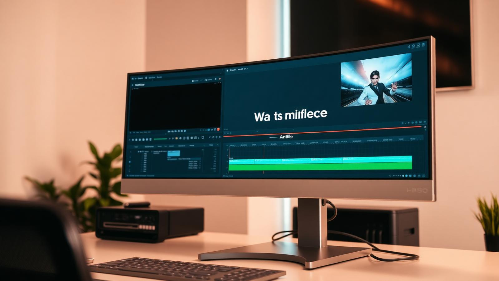
There's a moment that happens when someone watches a video from a small business and thinks, without ever articulating it, that these people know what they're doing. It usually isn't the camera. It's rarely the script. More often than not, it's the graphics, the clean title card, the name that slides in under the person speaking, the logo that resolves at the end.
Motion graphics are the cheapest credibility a small business can buy, and they're one of the most underused tools in local marketing. A two-person operation with a consistent visual system reads as more established than a twenty-person company posting raw phone footage. Customers don't audit your headcount. They read signals.
Why Movement Beats a Static Logo
Your brand assets probably already exist, a logo, a color or two, a font you use on invoices. The problem is that in video, static assets get skipped. A logo sitting in the corner of a frame is visual furniture. A logo that animates for half a second draws the eye, and the eye is what you're competing for.
There's also a memory effect at work. Repetition builds recognition, and motion graphics are the most repeatable part of your content. The footage changes every video; the lower third, the title style, and the outro don't. After someone sees your intro five or six times across different clips, they start recognizing your business before they read your name. That's brand recognition doing the work that ad spend usually has to.
The Four Motion Elements Worth Building First
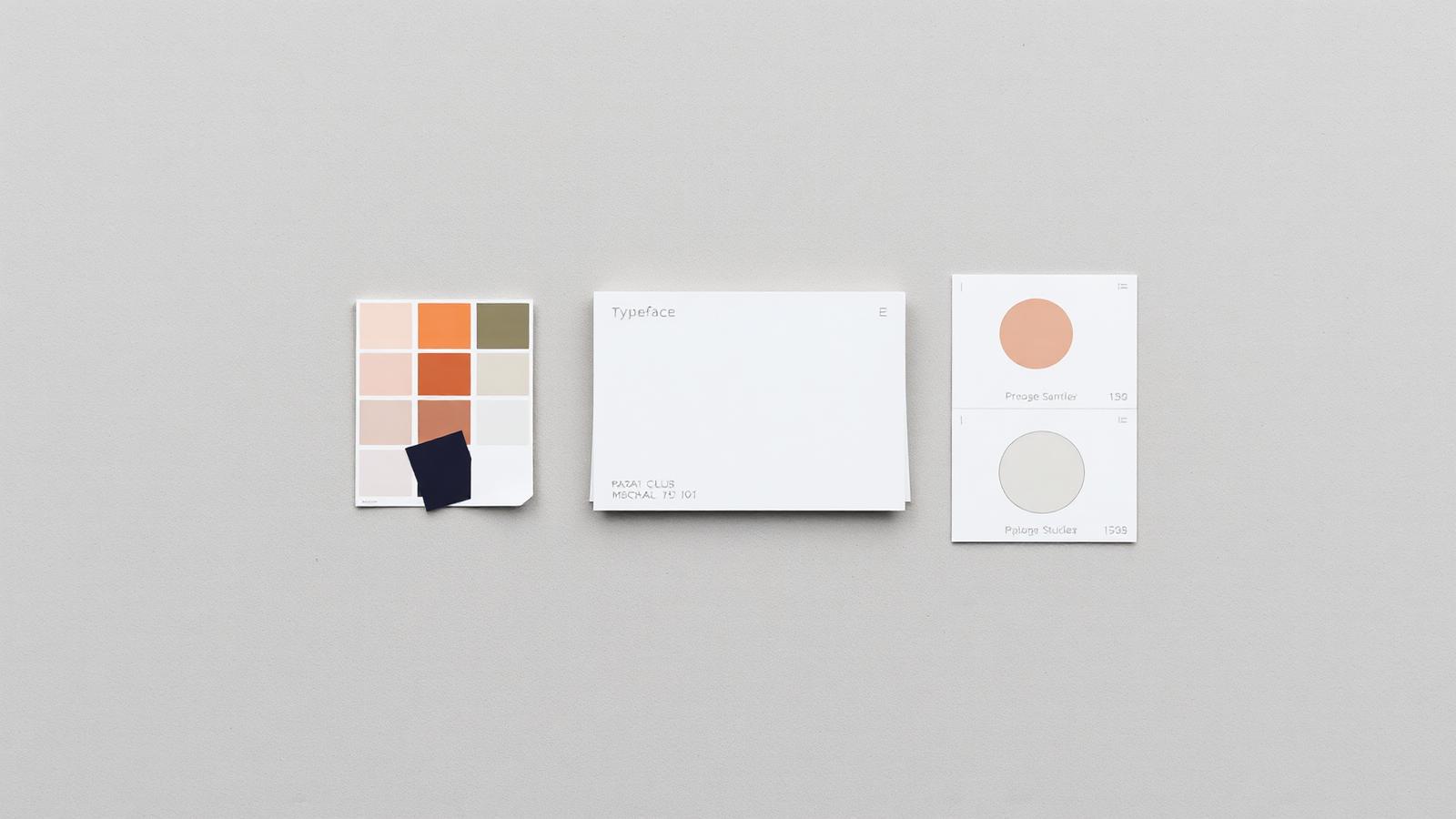
You don't need a full brand animation package. You need four small things, built once and reused forever.
An animated logo sting (2-3 seconds). Short enough that people don't skip it, distinctive enough that it registers. Put it at the end of short-form clips rather than the beginning, front-loaded intros kill retention on vertical video.
A lower third for names and titles. Whenever you or a staff member speaks on camera, a clean name bar makes the video feel produced. It also does practical work: it tells a first-time viewer who you are and what you do without you having to say it.
A text style for on-screen points. Most people watch video muted. A consistent way of putting key phrases on screen, same font, same placement, same animation in and out, means your captions become part of your brand instead of a generic auto-caption template that looks like everyone else's.
An outro card with one call to action. Website, phone number, or "book a consultation", one, not four. Reused at the end of every video, it becomes the thing people expect and act on.
Consistency Is the Whole Point
The temptation, once you have motion graphics, is to keep making new ones. Resist it. The value comes from repetition, not variety. If your lower third uses a different color every video, it stops being a brand cue and becomes decoration.
Pick one set of elements. Use the same two or three colors, the same typeface, the same timing. Apply them to everything, YouTube uploads, Reels, the clip on your homepage, even the slides in a client presentation. Consistency across surfaces is what makes a small operation feel like an established one.
A useful test: if someone saw a five-second clip of your video with the logo cropped out, would they still know it was yours? If the answer is no, you don't have a visual system yet, you have decorations.
What This Actually Costs You
Built properly, this is a one-time job. A motion graphics package for a small business is a handful of reusable templates that get dropped into every future edit in minutes. The cost is front-loaded and the benefit compounds with every video you post afterward.
What it isn't is a filter or a preset. Templates pulled from an app tend to look like templates from an app, and viewers pick up on that faster than you'd expect. The version that works is built from your actual colors, your actual logo, and the specific way you want your business to feel, polished, warm, technical, whatever fits.
That's the kind of work MorganMade does. Alongside editing YouTube videos, podcasts, and short-form clips, MorganMade builds the motion graphics and brand elements that hold a business's content together, the lower thirds, title cards, and animated logos that turn a series of one-off videos into something recognizable. If your content is getting made but not quite looking like yours yet, that's a fixable problem.
*This post was created with the assistance of AI.*